What do thousands of Costpoint users have in common right now? They're all working in the same modern experience, cleaner navigation, a more focused layout, and functionality that keeps growing based on their own feedback.
And it's not just a desktop story anymore. Costpoint Mobile has caught up too. More on that below.
Desktop experience: designed for focus, not just aesthetics
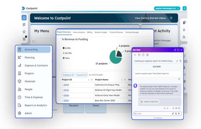
It's easy to mistake a redesign for a visual refresh. That's not what this is. Every change to the desktop experience has been made with one goal: helping you find what you need and act on it faster.
The Command Center is the clearest example.
Introduced last year, this role-based workspace is designed to surface the most relevant information for a given job: project analysts see their priority tasks, like projects with missing information, and accountants see the financial data that needs their attention, without digging through menus.
Since its release, the Command Center has expanded to additional user roles and added more specialized views within those roles. Whether you're closing out the month or checking in on project health, the Command Center puts the right information in front of you without the extra clicks.
That same philosophy shows up in smaller, easy-to-miss details. My Menu lets you organize your most-used applications through drag-and-drop customization, no more scrolling through a generic list to find what you use every day.
"Love the new My Menu! So much easier to organize and find my apps,"
- Chrissy Funk of Nokia Federal Solutions.
There's also a set of thoughtful improvements that solve real, everyday friction: the flexibility to display a breadcrumb trail directly in the interface, or keep the layout cleaner without it; color indicators that flag which company you're working in, giving multi-entity teams a clear at-a-glance view of which environment they're working in.
The Learning Ribbon, a favorite among the features released with the new Costpoint UI, now has even more configurability: admins can not only swap and customize the learning videos it displays, but also control that by user group.
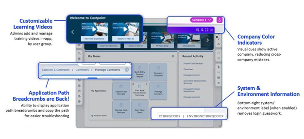
None of these changes are dramatic on their own. Together, they add up to fewer clicks, faster onboarding, and fewer mistakes.
"The new UI is sleek, intuitive and just easier to use - everything flows better,"
- Samantha Presser of SURVICE Engineering Co.
The mobile experience: work doesn't stop at the desktop
Costpoint Mobile gives you full access to Costpoint, not just a piece of it: accounting, projects, time, expenses, and any other modules you access, all built for whatever device is in your hand. What's new is the experience itself.
It's now more modern, intuitive, and aligned with the desktop UI, creating a more consistent experience no matter which device you're working on.
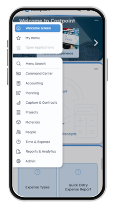
That includes support for expense authorizations, Ask Dela on mobile, and modern authentication like passkeys for simpler, more secure logins.
If this is the first time you're hearing about Costpoint Mobile, now's a great time to get started. Getting started doesn't require a trip to an app store, either - Costpoint Mobile installs as a browser-based app directly from a device, with QR code onboarding for quick setup.
The mobile experience keeps getting sharper: redesigned time entry screens, a more streamlined expense submission workflow, and a reworked authorization flow, all aimed at cutting down errors and speeding up approvals in the field.
And it's not a one-time pass, Costpoint Mobile keeps evolving right alongside the desktop experience, with more improvements already on the way.
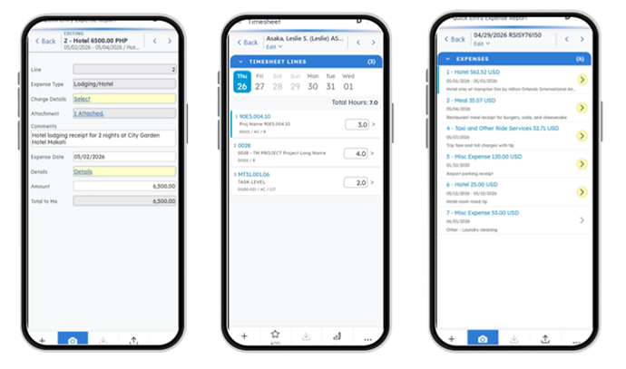
Teams already using these updates are seeing exactly that - faster turnaround and fewer mistakes on submissions that used to eat up time between job sites.
For distributed and field-based teams, that's the difference between waiting until you're back at your desk to submit an expense report and getting it done the moment you think of it.
Refinements made along the way
None of this happened by accident. Customer feedback comes in through quarterly Town Halls, our UX Lab, Elevate (our annual user conference), and online feedback forms, and those conversations, along with product feedback and support requests, directly shape what's rolling out to all users.
A good example: breadcrumb navigation. When customers asked for it, we listened, and it's back. That's the flexibility you see today: a breadcrumb trail right in the interface, wherever you're working.
It's a small feature, but it captures a simple pattern that shows up throughout this update: customers ask, and the product responds.
"The new Costpoint UI is modern, easy on the eyes, and streamlines navigation with fewer clicks,"
- Sharon Amoroso of Seneca Holdings.
The thread that connects it all: Ask Dela
As part of this experience, no single capability stands on its own, and that's especially true of Ask Dela. Dela is built directly into the experience. Open it whenever you need it, and it docks right alongside your work on desktop or mobile, so getting an answer doesn't mean losing your place.
Ask Dela in plain language, and it can complete tasks or summarize information without requiring you to hunt through menus or surf through help documentation. It's less a feature you turn to and more a layer that's present across the way you already work.
As Costpoint continues to evolve, Dela is the connective tissue tying desktop and mobile into one coherent experience, and the foundation for deeper automation down the line.
What this means for your business
Strip away the individual features, and the throughline is business impact. Faster onboarding means lower training costs and less time before new hires are fully productive.
Fewer clicks and fewer errors translate into real time saved, and fewer costly mistakes, like the kind that used to happen when a multi-entity team lost track of which company they were working in.
Mobile parity means distributed and field teams stay productive without being tied to a desktop. And built-in AI guidance through Dela means less time on support tickets and more time on the work that moves the business forward.
"I have enabled the new interface. I love it! I can't wait to share it with my users,"
- Valerie Danielson of MAG Aerospace.
For finance leaders and executives evaluating where to focus resources, that's the real story: this isn't cosmetic. It's an investment in operational efficiency that compounds over time, and it's laying the groundwork for the next wave of AI-powered automation across Costpoint.
Getting the most out of it
There's nothing to set up and nothing to configure. If you're in the new experience today, you're already set. The better question isn't how to get started, but how to get the most out of what's already there.
The Deltek Learning Hub has walkthroughs and guides if you want a refresher on what's changed and Ask Dela is available in the moment if you have a specific question while you're working.
See it for yourself
The Costpoint experience keeps improving, refined continuously based on direct feedback from the people who use it every day. If you haven't spent time in it recently, or you're curious what's changed on mobile, now's a good time to take a look.
For a deeper look at the latest Costpoint 2026.3 enhancements, check out the Costpoint 2026.3 Admin Highlights Video.
Product Learning
Deltek Learning Hub
Explore product training, documentation, learning resources and more to maximize your use of Deltek Costpoint.